- Web System Design
- UX Design
- Enterprise Software
- Information Architecture
About Evaluation Builder
NEOGOV is a Human Resource Management System and Statistical Analysis System software company focused on the public sector. Perform exists within the NEOGOV platform and is used to construct, conduct, and track performance reviews. This project's goal was to redesign the entire process for setting up a performance review.
With over 1,500 government agencies and educational institutions using NEOGOV HR software, NEOGOV has become one of the leading providers for public sector software. After Perform was released in the early 2000's, it became clear after some time that a refresh of some critical UX flows were needed. The entire process needed improvements and finessing.
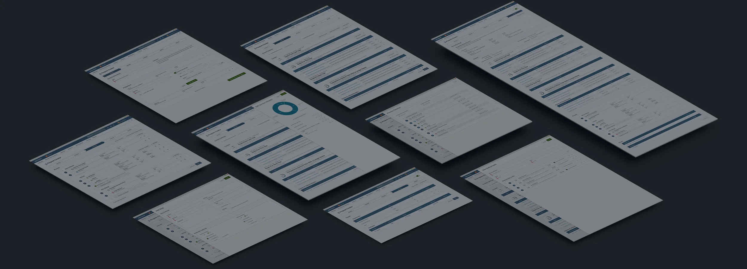
The evaluation program creator is the largest and most intensive process in the Perform application. The ability to completely customize the entire process creates a plethora of minute settings which must be integrated carefully throughout the system. This massive process had to be simplified down into a clear and easy to understand flow while not hiding away customization features.
My Role
Since Perform was an existing product, my role was to improve the core functionality of the evaluation program creator setup process to be clear and simple, and to integrate new features which allow users to create a completely customizable performance review process. I worked closely with the product manager and developers to create a full system which was to be built off of the legacy code, but appeared to be a completely new system.
Defining the Problem
As an existing product which had not been created by a designer previously and taking into mind the existing users cannot take too many updates all at once, updating the evaluation program creator presented many obstacles and puzzles to be solved. Not only was legacy code was often circumnavigated to avoid altering existing code while still improving core functionalities and improving the look and feel of the interface, but updates had to be introduced to users in stages rather than all at once.
The old Perform system was first created in 2001, and had not been created with a designer on the team. This presented many opportunities for improvements not only to the UI, but also to the system-wide functionality. Perform was often known as the application under the NEOGOV suite which was very difficult to use and too confusing for new customers. Our Customer Support team used to have to spend endless hours implementing and onboarding new clients. Many customers used to have accounts with other products in NEOGOV but not with Perform because of this.


The former system collected all functionalities on a single page with a countless number of miniature grids to house sections of information which users would scroll through. Features were often hidden behind poorly designed buttons which appeared confusing to users. Many customers did not use some features because they were unaware of where they could access it. Perform was long overdue for some care to boost the visual appeal and get users excited about conducting performance reviews; which is a difficult task in itself.
Mapping the Process
Evaluating and analyzing the existing user flow revealed several areas in need of improvement. Some areas had to be rethought and redesigned from the ground up. New features were woven into the existing functionality and provided solutions to the issues revealed by existing users. Each main section of the process was broken up into four different pages plus a final overview page. This allows the users to accomplish creating one major element at a time without getting overwhelmed by everything all at once.


The evaluation program creator process is the largest and most intensive flow in the Perform application. The ability to completely customize the entire process creates a plethora of minute settings which must be integrated carefully throughout the system. The existing system laid out everything on one page. This presented an overwhelming amount of options to take in all at once. Breaking up the core sections into separate pages allows users to focus on one important area at a time.


Sketching out the plans
This was a very large project which spanned across an entire year. Our team had to regard our current clients to make sure that we introduced changes slowly and allowed time for users to adapt. We approached the changes in sections based on each tab step. The first change was introducing the new UI and core setup of the five different steps. Users were given a testing environment to learn the new system and setup any necessary changes before they activated their live accounts with the updates. Once users became comfortable with the new flow of the system, then we introduced more specialized settings for higher levels of customization. Administrators also have the option to turn new features on or off under the administrator settings panel.
Due to the fact that we were overhauling the core setup of the flow, there was a lot of time spent planning how the new system would function. I worked closely with the Product Manager and Lead Developer for Perform in order to create the ideal flow. Once the core flow was established, then the UI had to allow users to not be overwhelmed by the plethora of functionalities available. Choices were made to place some setting behind flyouts or dropdowns rather than having everything upfront. The argument would often arise asking if hiding away functionalities was the best choice. This was determined in a case-by-case basis based on direct user feedback as well as user testing. We were able to follow statistics on how often a functionality is used to better determine if it needs to be up front or farther back.
Updating the Pattern Library
As a product that had been created over 10 years prior and had never been originally looked at by a designer, there were UI updates that needed to be done. Perform is a product under the umbrella of NEOGOV which had an existing pattern library for universal elements. However, introducing new designs caused the temptation to diverge from the existing pattern library. It was important to maintain a close relationship to the existing styles not only for consistency with our UI, but also to not startle our existing users by changing too much at once.
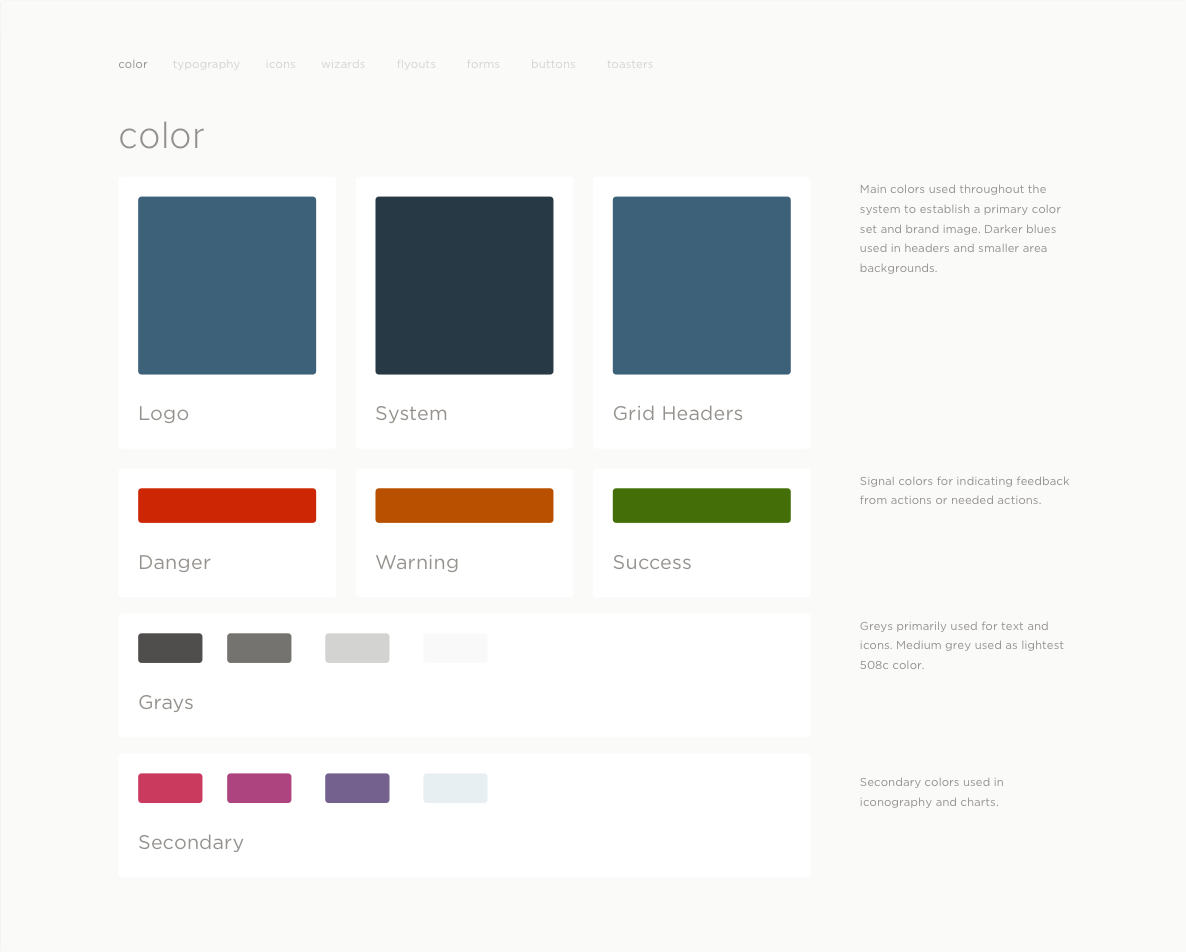
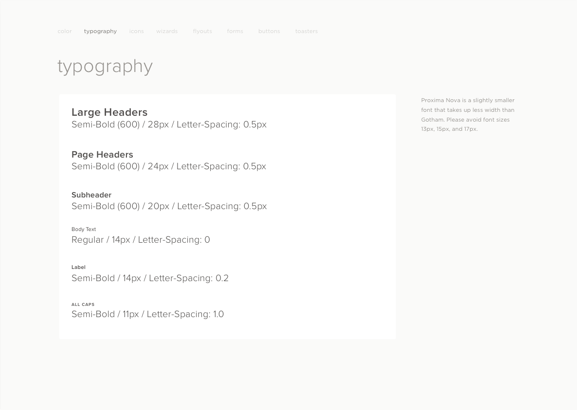
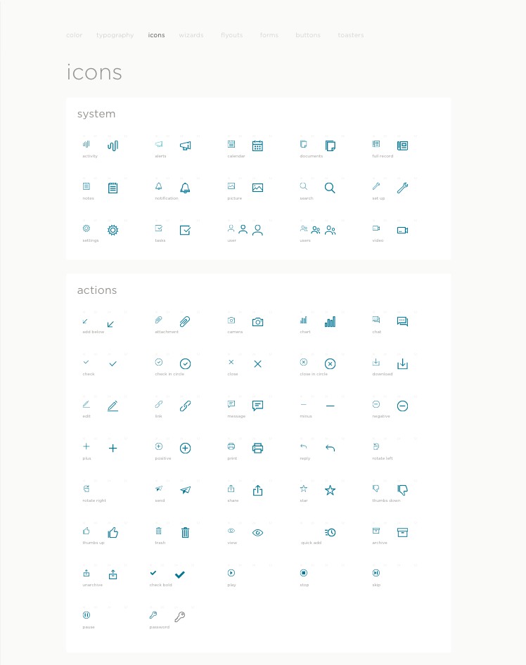
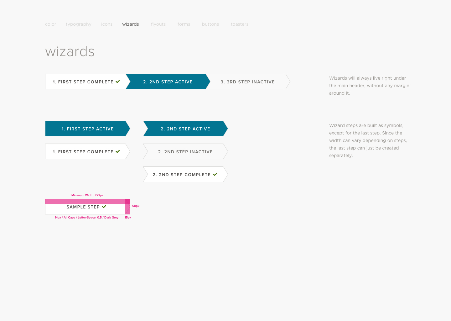

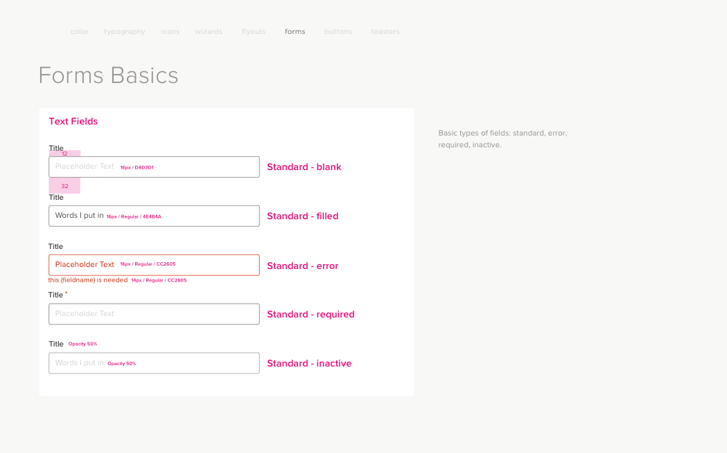
The Template Creator is where users see various patterns for the first time and will continue to use throughout the rest of Perform. It was important to establish universal patterns which exceptional functionality that could be reiterated in many other areas. Not only did these new designs need to adhere to established patters in the system, but all functionality must be created to be compliant for the public sector. This means that there were guidelines to follow when creating elements in order for users who might have impairments to be able to access all features.
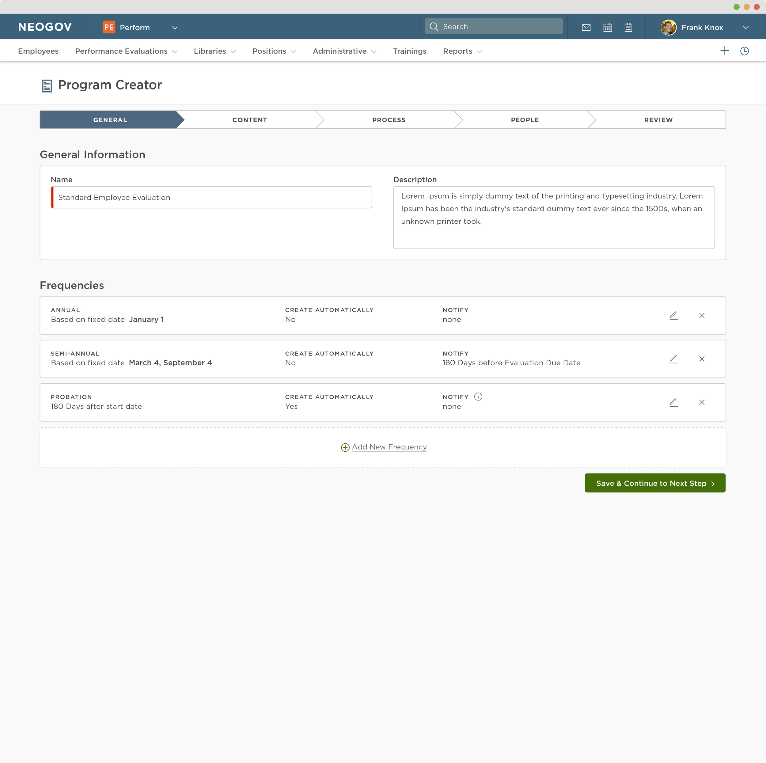
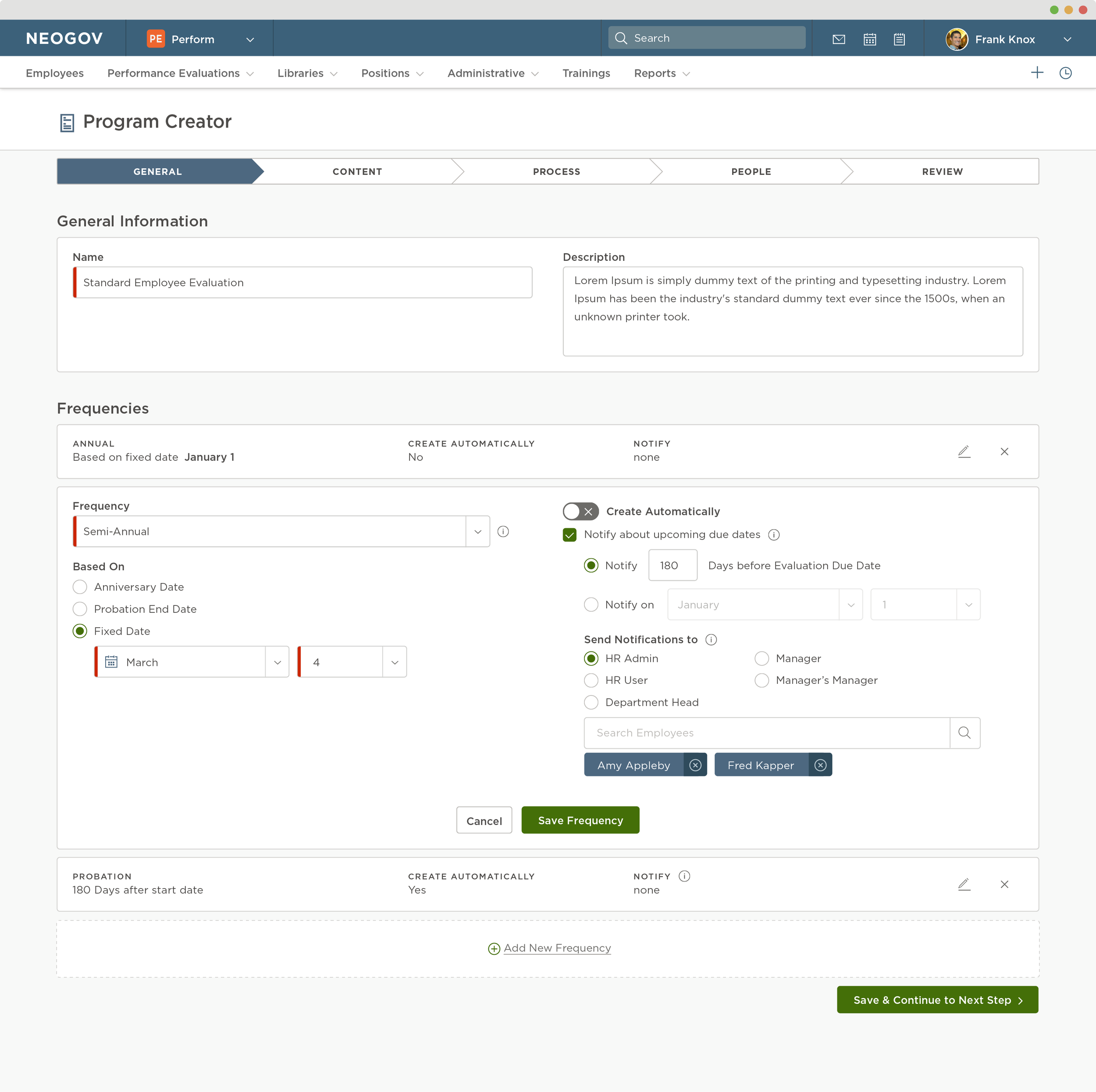
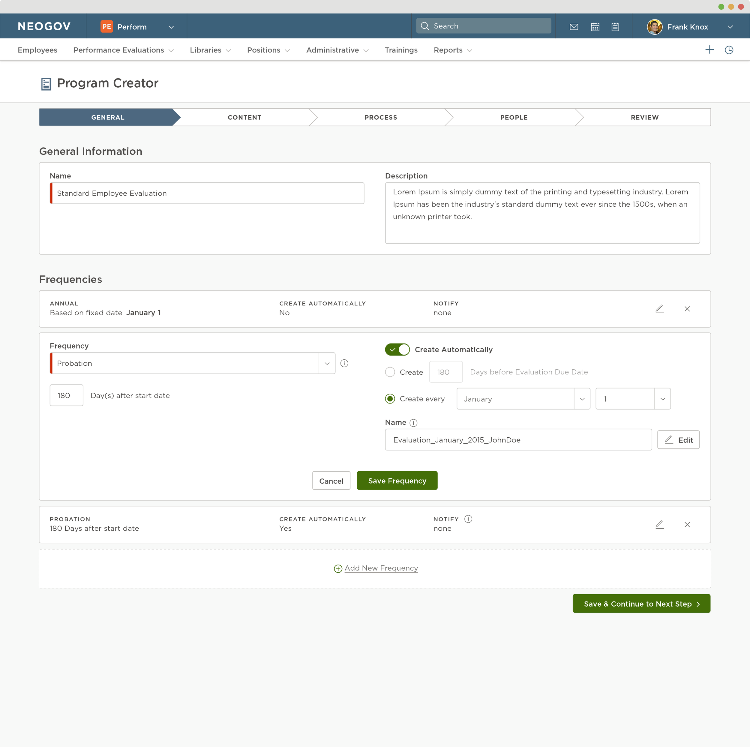
General Settings Page
The first page of the user flow guides users to create the required information. Once all required fields are filled in, then the user is prompted to save and move on to the next step. Every step throughout the flow can be backtracked. A user can choose to complete information in any order they please; however, the tab pages guide users to complete the flow in an optimal process.
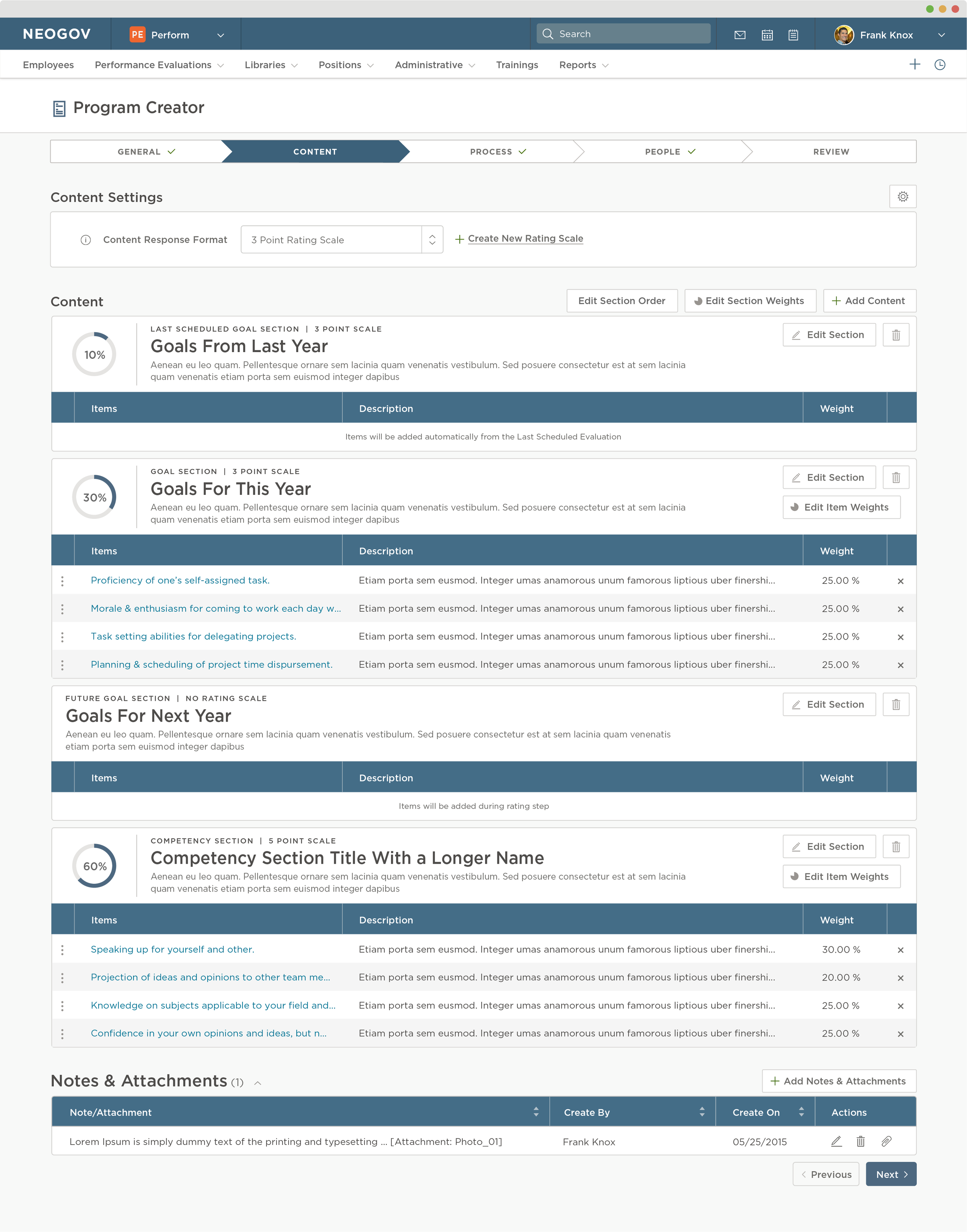
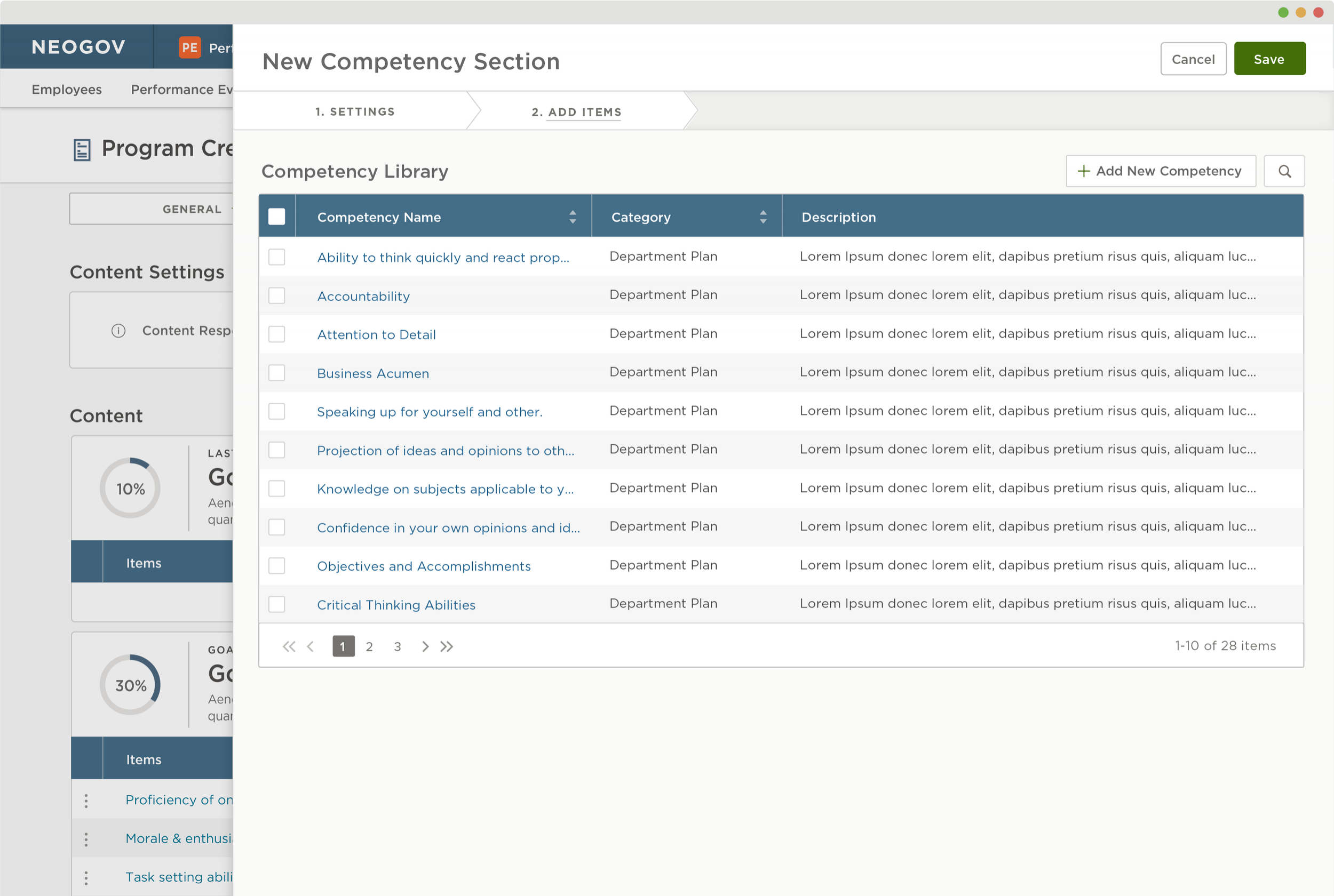
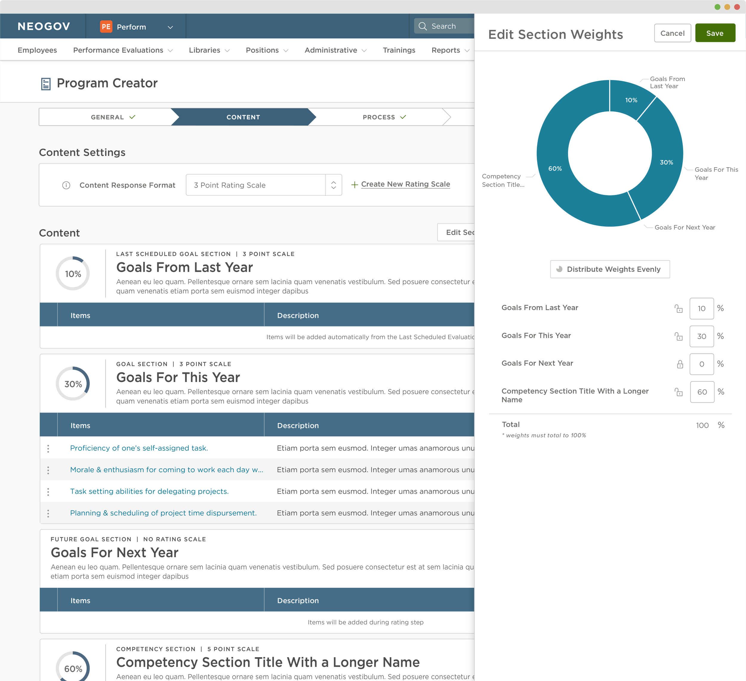
Content Creator Page
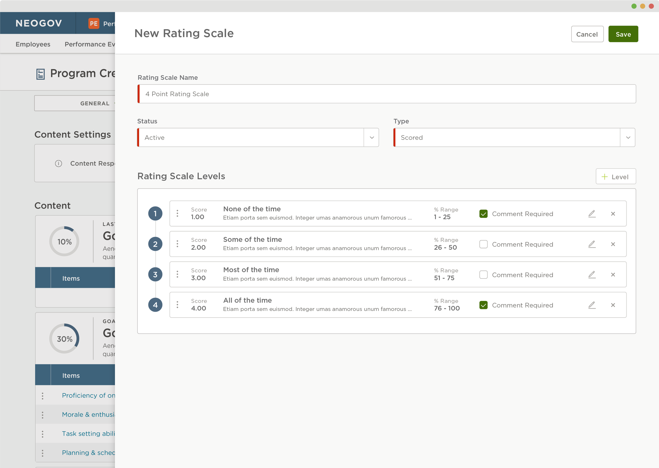
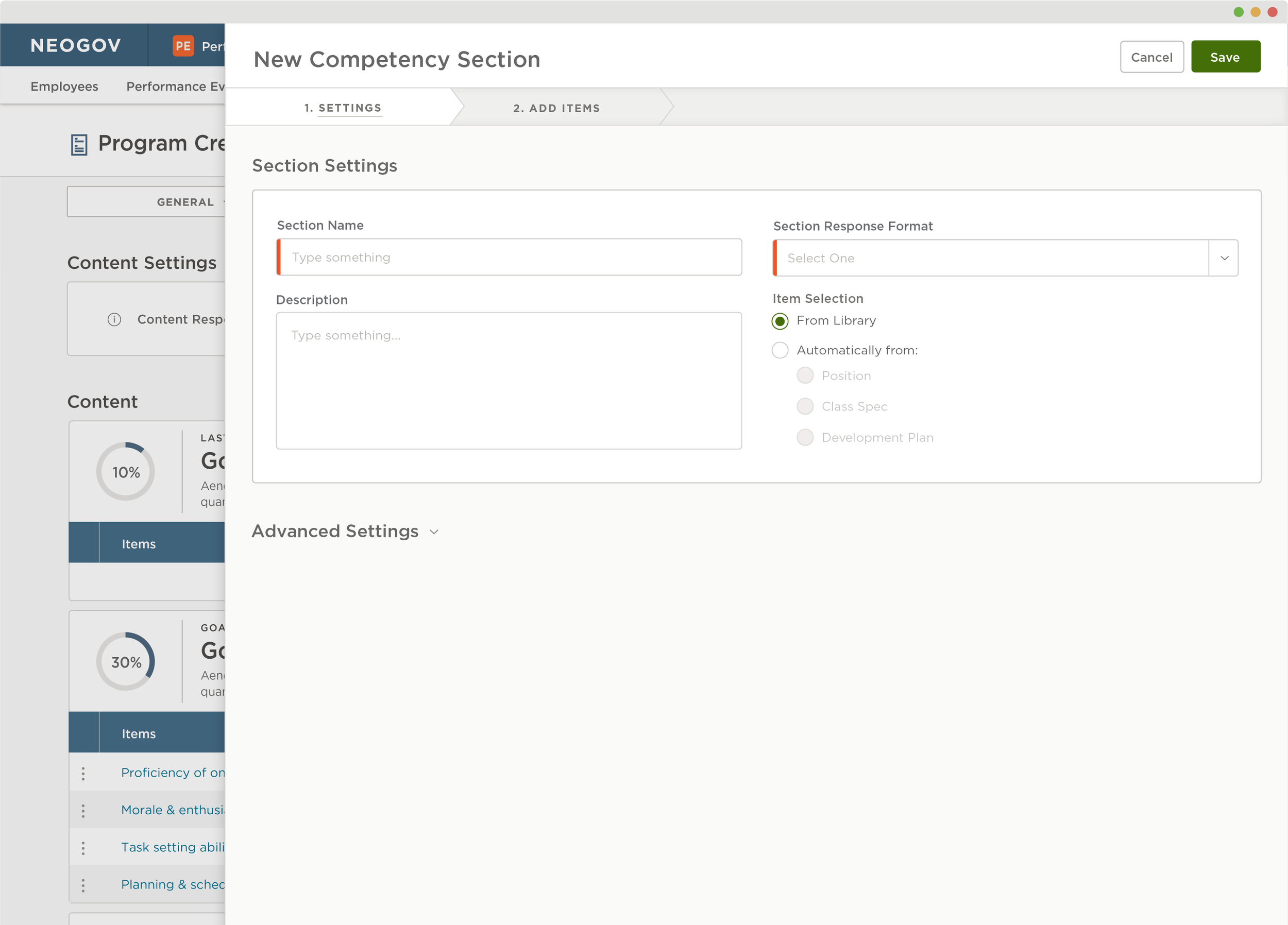
This page is where users decide what specific goals and competencies are going to be on the evaluation. Sections provide the space to organize each rating item which can be added either from a library or by creating a new item on the fly. Each section has it's own customizable options which allow
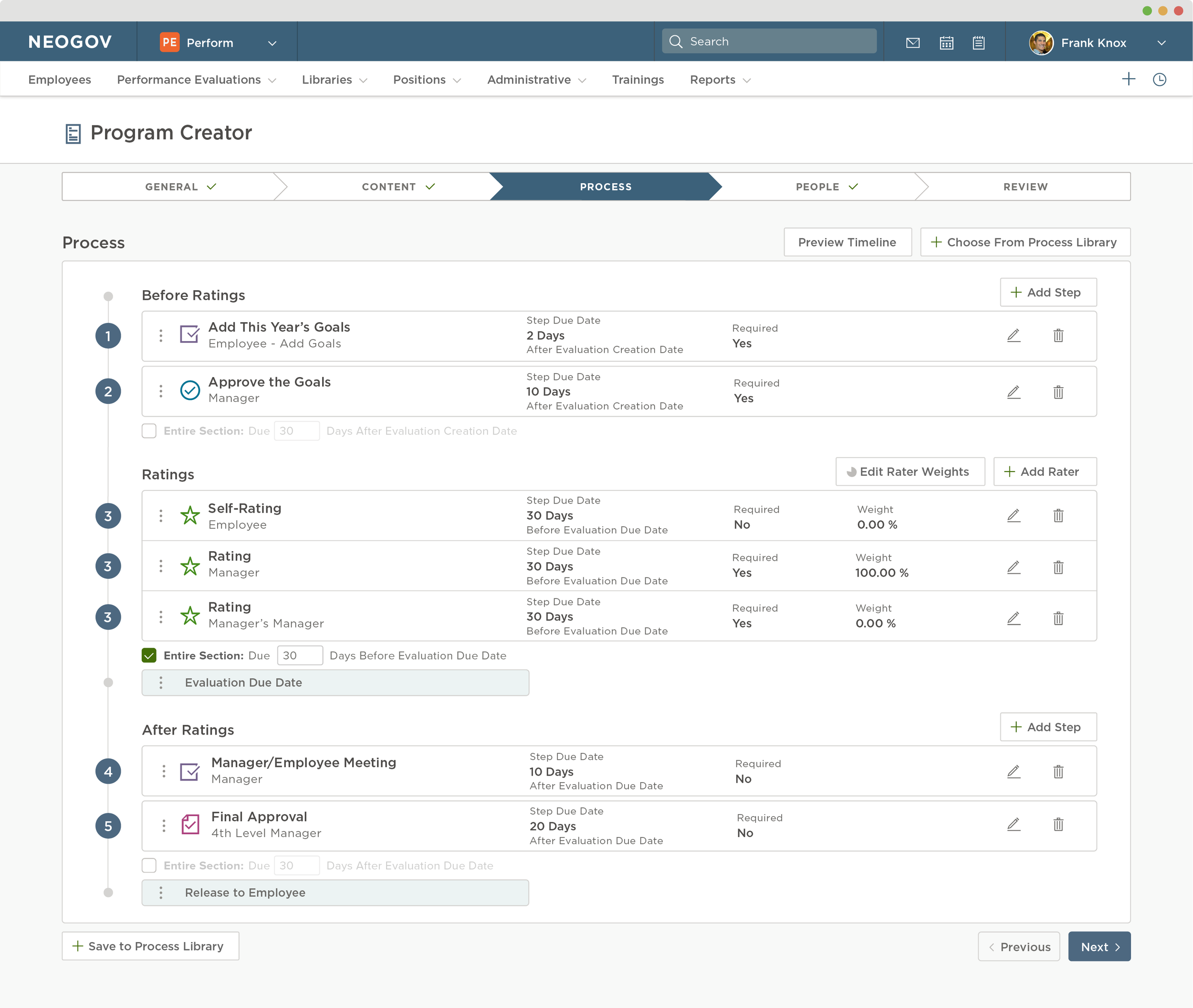
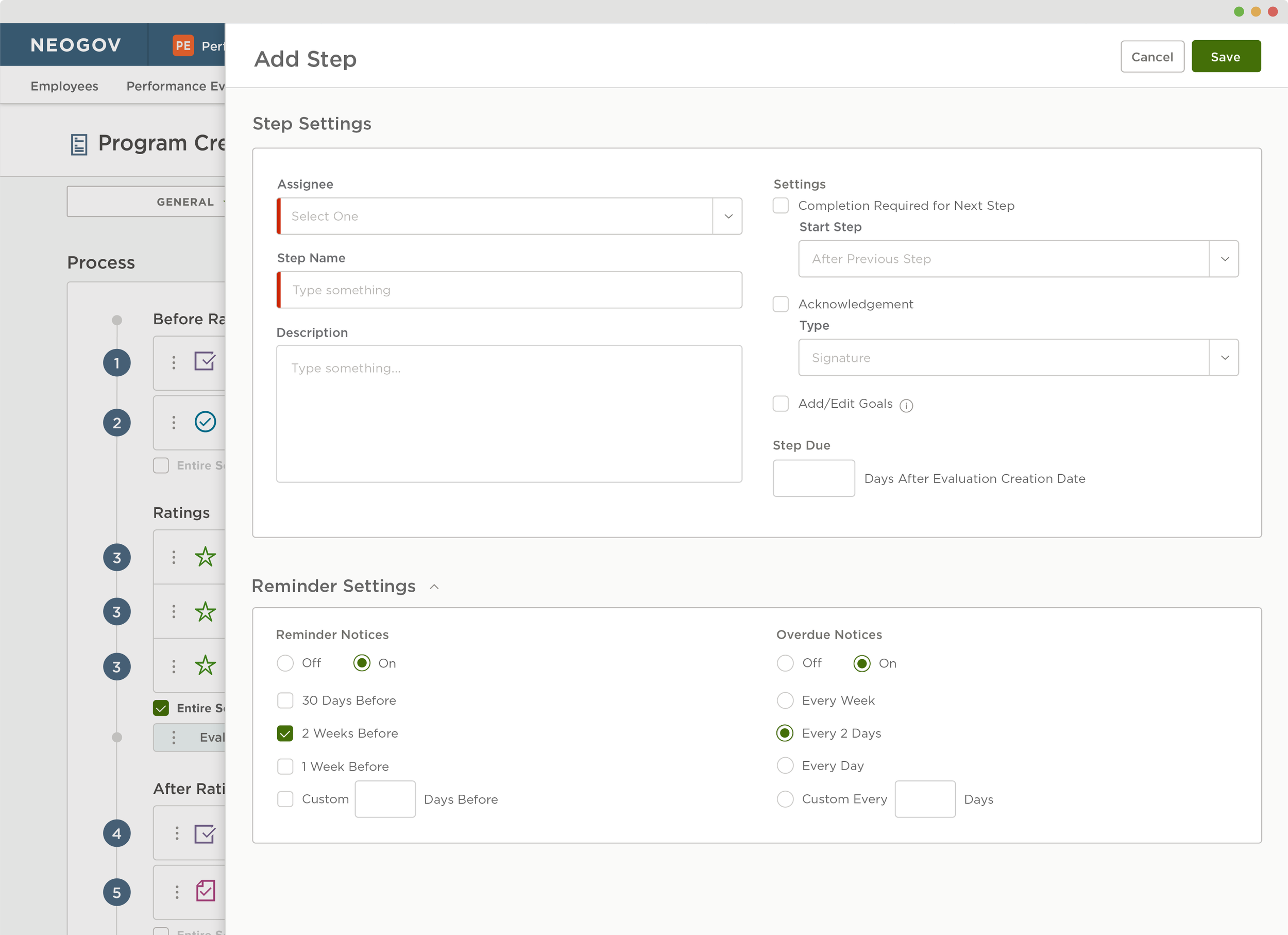
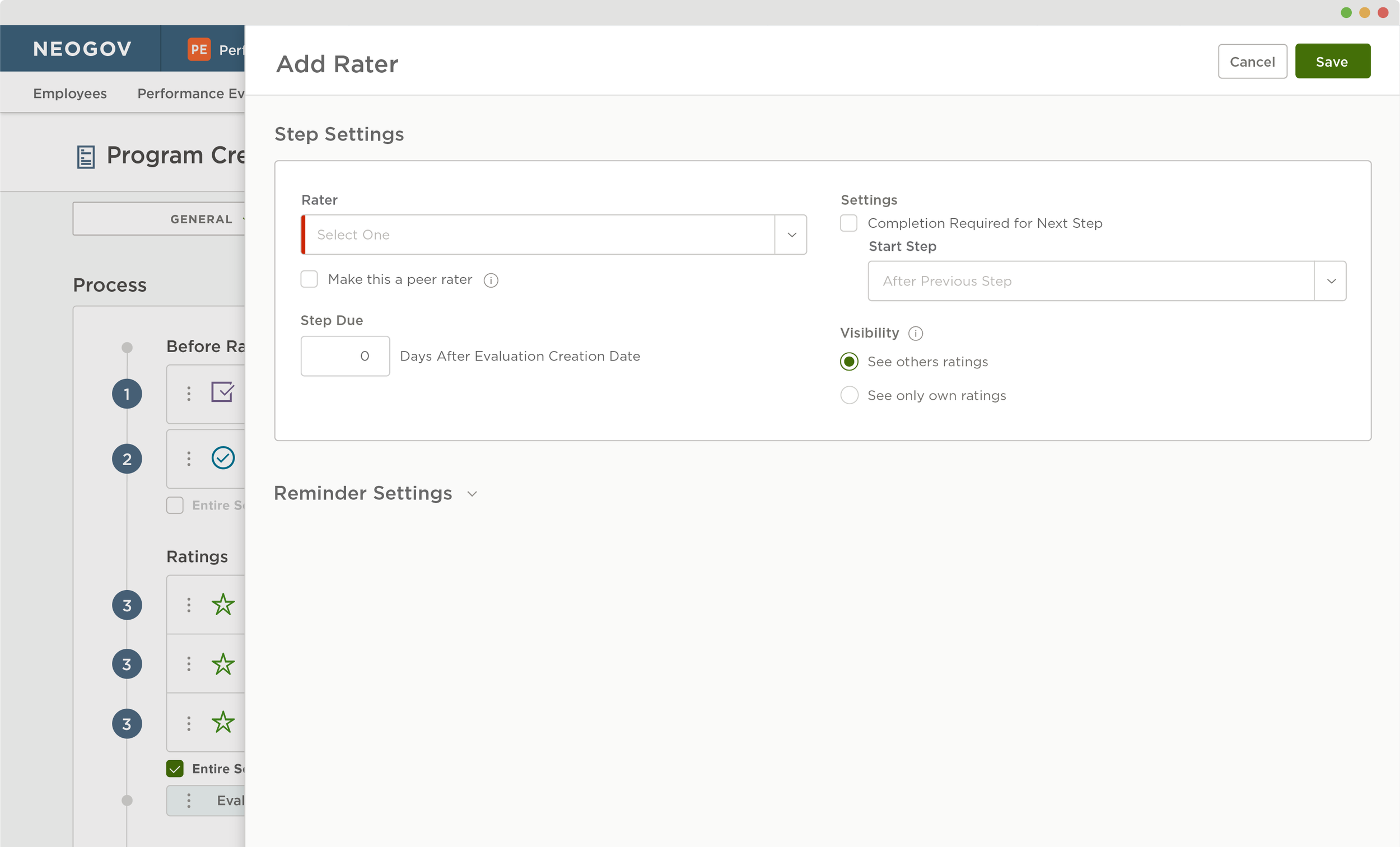
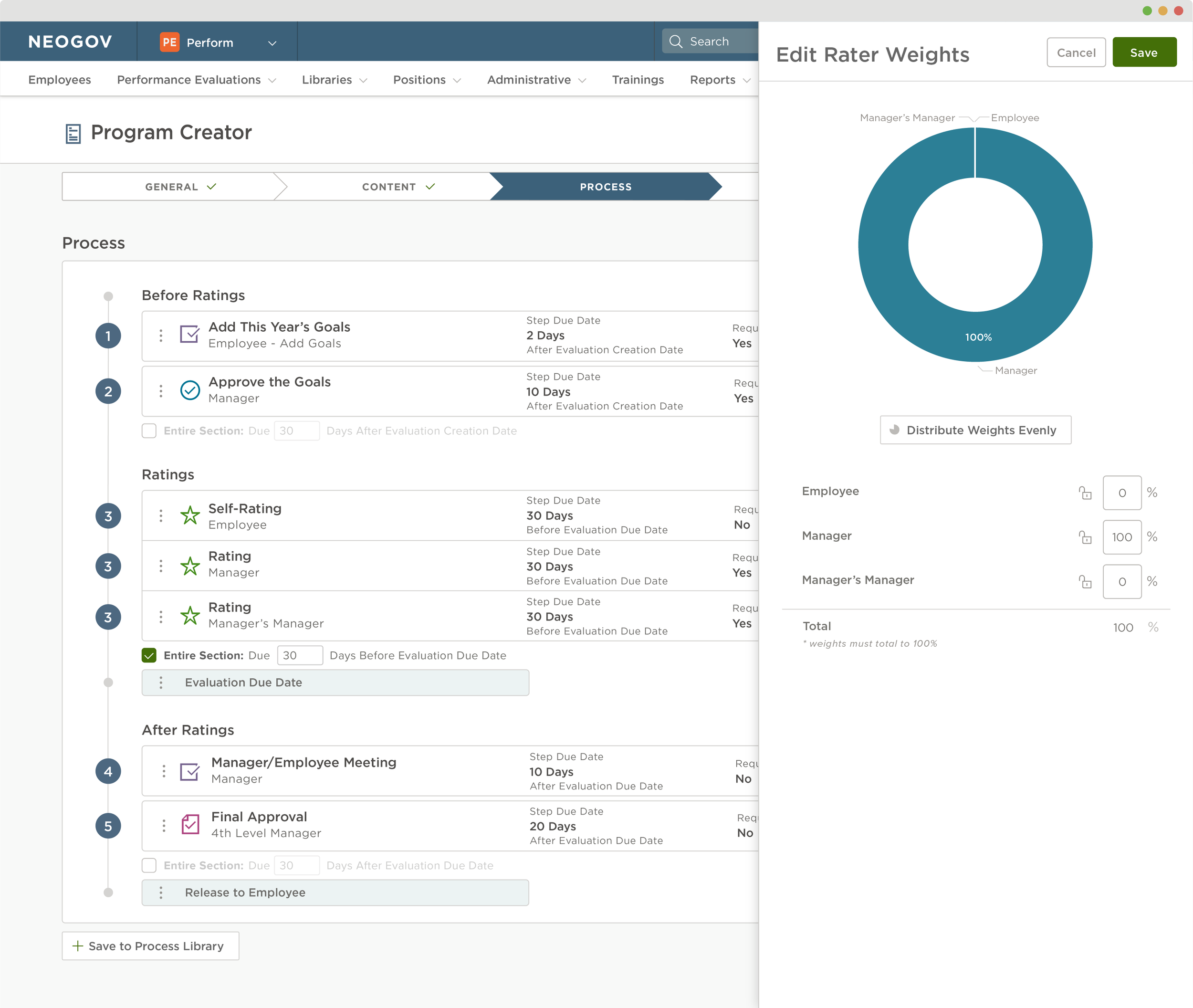
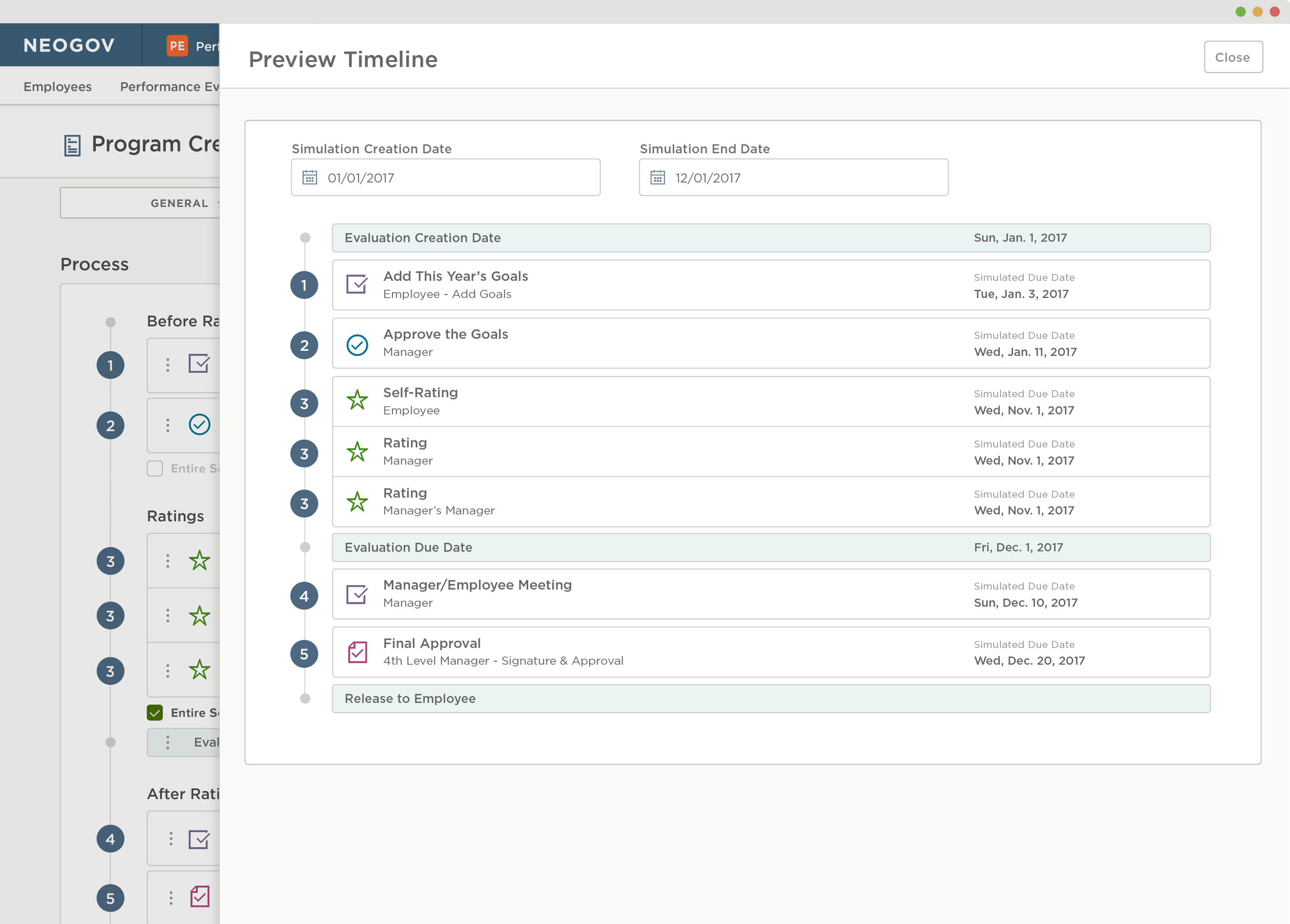
Process Creator Page
The process page is the user establishes the timeline for the entire performance review. Steps are created with due dates and assignees to establish who is responsible for each step. Reviewers are added as the main section of the process. Users can customize a plethora or options pertaining to each step.
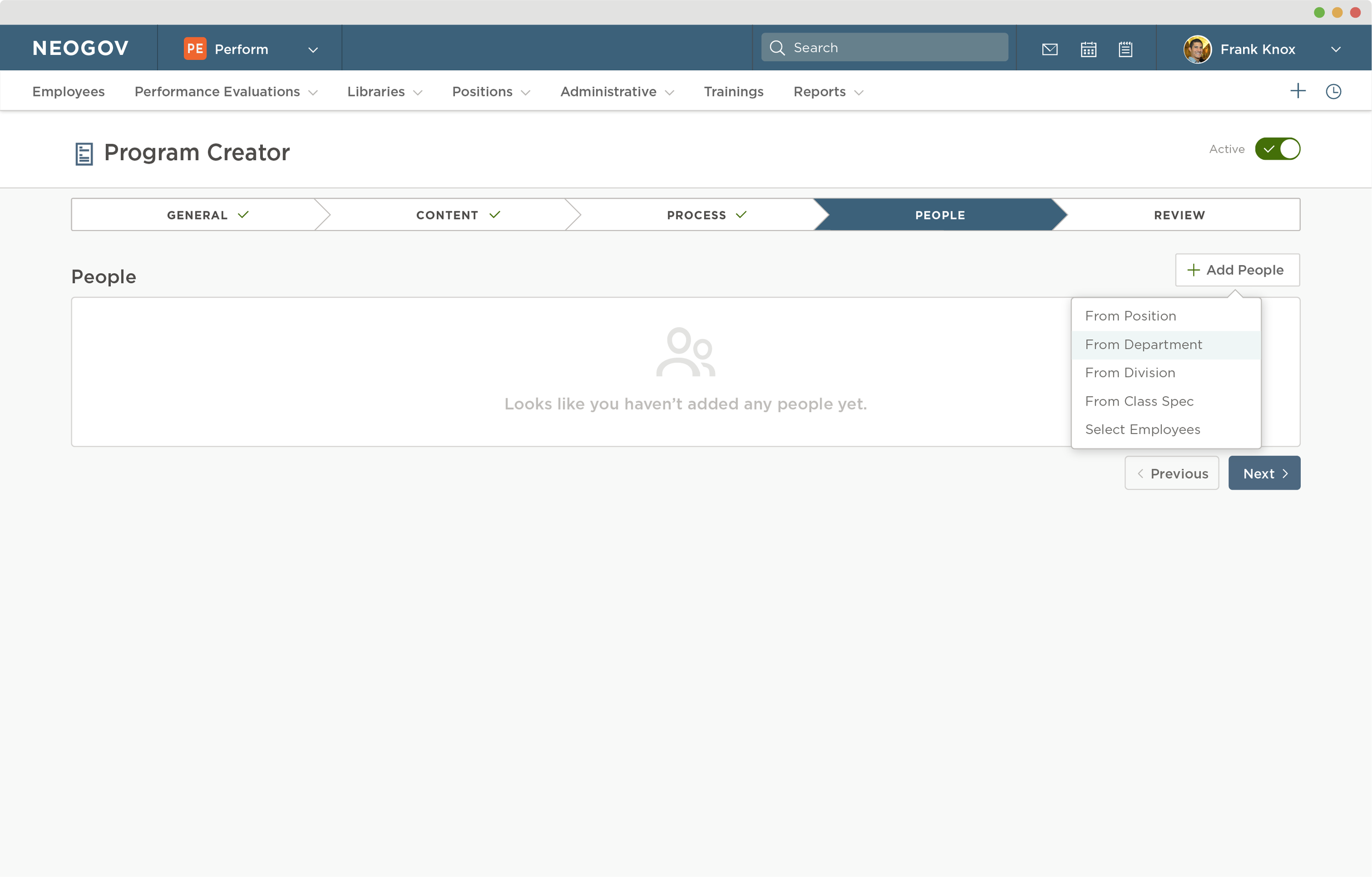
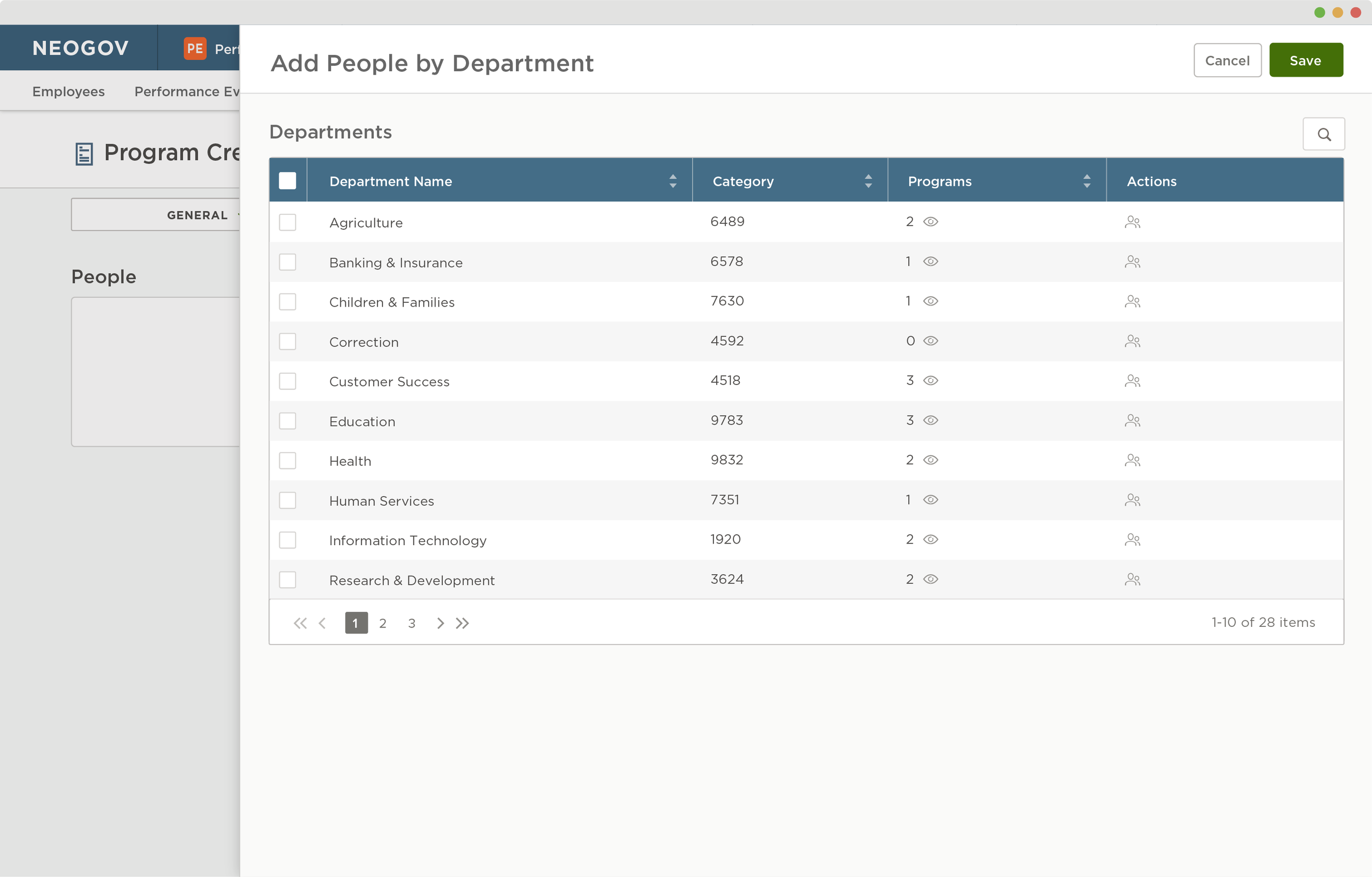
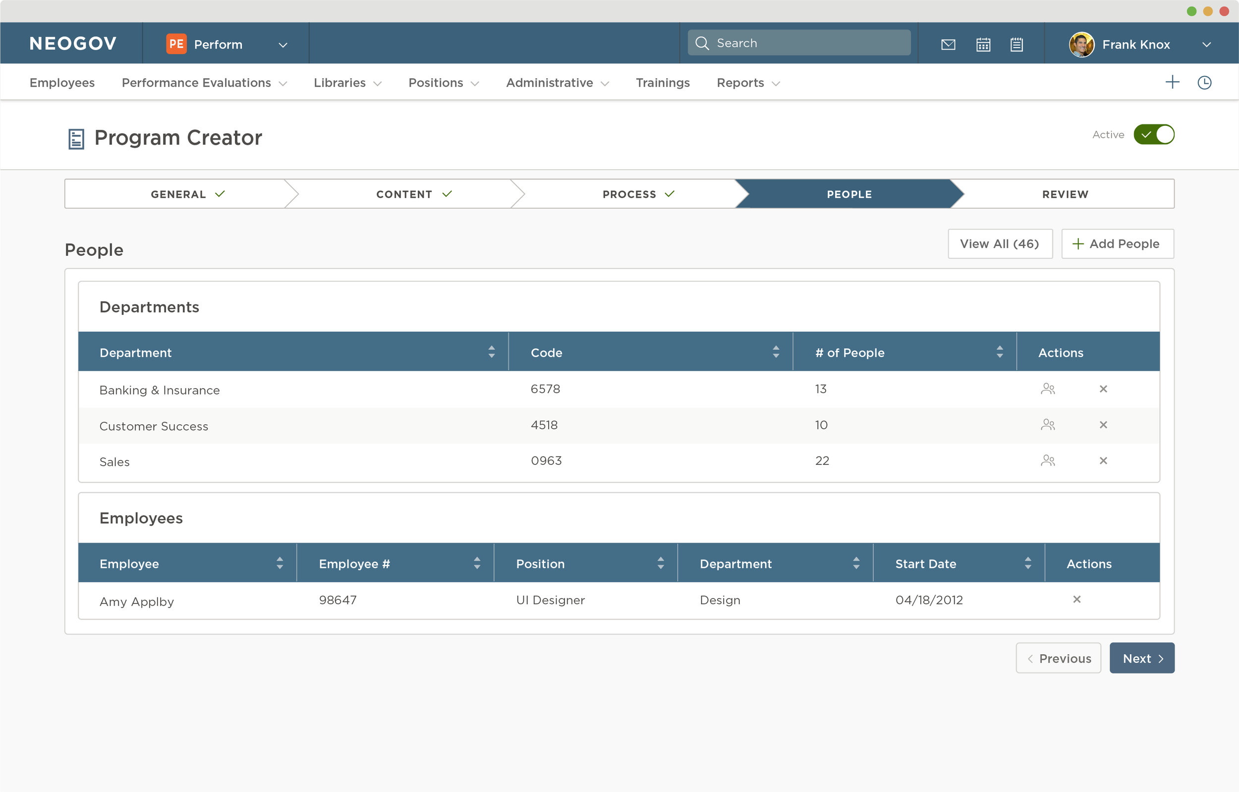
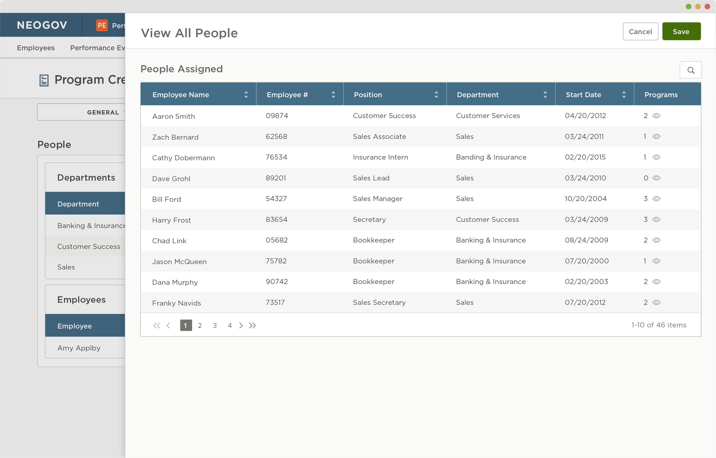
Adding Users to the Template
The people page is where the user selects which employees will be assigned this particular evaluation. Assignees can be determined by department, location, specific employees and more. Adding assignees based on categories, rather than choosing specific employees, allows for new employees to be automatically added into the performance review process that applies to them based on established criteria.
review and activate
Users can review all settings in the final page of the template creator. This is a view only page which is a representation of what each section will look like when they are repeated throughout the rest of Perform. If any changes need to be made, then users can navigate to the desired page from the tab bar. Once all required information is filled out, then users are able to activate the template which starts any automated settings. Once activated, the entire evaluation will be created on the determined date for each individual and the process will begin.
Accomplishments
These pages were created as part of a high-fidelity clickable mockup using InVision. It was sent out to the development team to then be coded into the live site available to all NEOGOV Perform customers. The Evaluation Template Creator is a large-scale function within Perform. It is constantly being improved and updated. This was the largest part of updating the system, and I have also worked on many additional features which interlace with this project. I have gained a detailed understanding of this system and am involved with any updates that are made to it.