
- Web System Design
- UX Design
- Enterprise Software
About the Rating Form
Public sector performance reviews are conducted based on specific timelines and content which must meet specific regulations. The rating form is where the evaluation of each employee based on specific competencies is conducted. Employees can be rated on a scale and have comments made. There are also many other assistive attributes in the rating form which helps evaluators have a more streamlined evaluating experience.
My Role
Since the existing flow for completing a rating was good enough to not need a full overhaul, my role was to improve areas that were in need of care. Parts of the system were often found to be confusing or frustrating to users, and needed to be fixed. I utilized the resource of our live user calls to get feedback directly from our customers to then work towards defined goals.
Identifying Challenges
With over 1,500 government agencies and educational institutions using NEOGOV HR software, NEOGOV has become one of the leading providers for public sector software. Since Perform was released in the early 2000's, it became clear after some time that a refresh of some critical UX flows were needed. The entire process needed improvements and finessing. This project involved many iterations due to features being added later in the process after receiving feedback from users on early designs. This required additional work to integrate new elements into the designs. Trials and tests were conducted on existing users to insure that they would understand the system and everything it had to offer. This project involved many iterations which were stepping stones to the final product.
The old Perform system was first created in 2001, and had not been created with a designer on the team. This presented many opportunities for improvements not only to the UI, but also to the system-wide functionality. Perform was often known as the application under the NEOGOV suite which was very difficult to use and too confusing for new customers. Our Customer Support team used to have to spend endless hours implementing and onboarding new clients. Many customers used to have accounts with other products in NEOGOV but not with Perform because of this.


The former system needed visual updates more so than it needed UX updates. Some odd interactions existed which caused frustrations among our users. Things such as automatic scrolling or expanding large areas which result in endless scrolling. Some useful features were hidden behind less important screens causing them to not be used. Raters were unable to review the entire rating report during rating, and were unable to save a rating which was in progress.
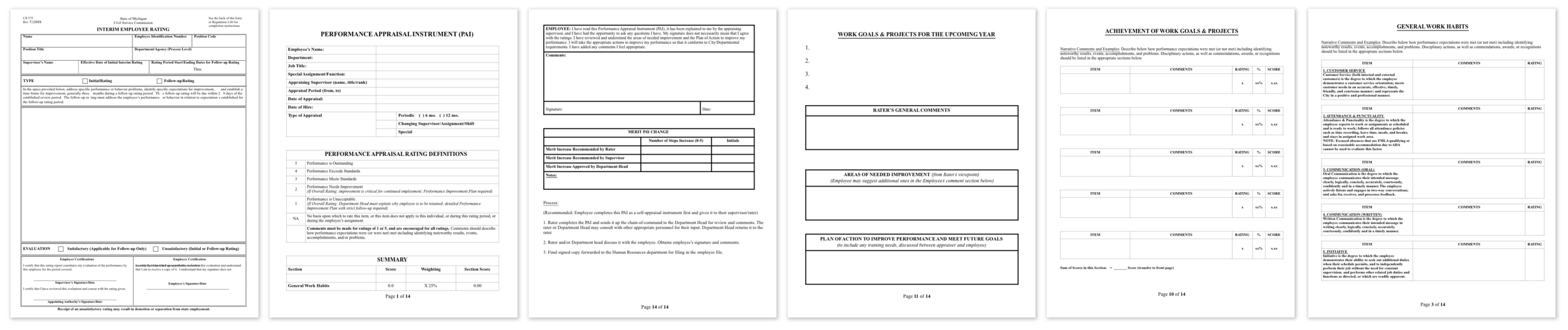
Existing Standard Rating Forms
Result from user research of existing customers revealed that evaluators preferred to print out blank forms to conduct evaluations on paper. Or users would have aspects of the evaluation completed outside of the system. The goal with this project was to get all of our customers to complete evaluations entirely in the system without needing to turn to paper forms for assistance. Most paper evaluations were arranged by each item having a number rating and ability to leave a comment. Scores would have to be calculated by the users which present an opportunity for mistakes.
Organizing Information
The new system needed to be built as a step-by-step system which also allowed for users to hop around to various items as they pleased. Completing ratings are like taking an exam; the answers don't always have to be completed in the designated order. Users needed to be able to step back from an individual rating item in order to easily see an overview of the rating as a whole. This allows the user to evaluate a candidate as a whole as well as by individual items.

Focusing on one thing at a time
By separating each item into it's own flyout users can approach each rating item in the same way that they were used to when completing ratings on paper forms.

Accommodating a Plethora of Features
Flyout in the NEOGOV system slide in from the right of the screen. The back page remains visible in order to keep a connection with the content behind. The rating form however, contains a lot of information which users need readily available and can't afford wasted space. A pattern was created to take over the full screen only when the user need extra information in order to accommodate all of the flyouts features.
Results
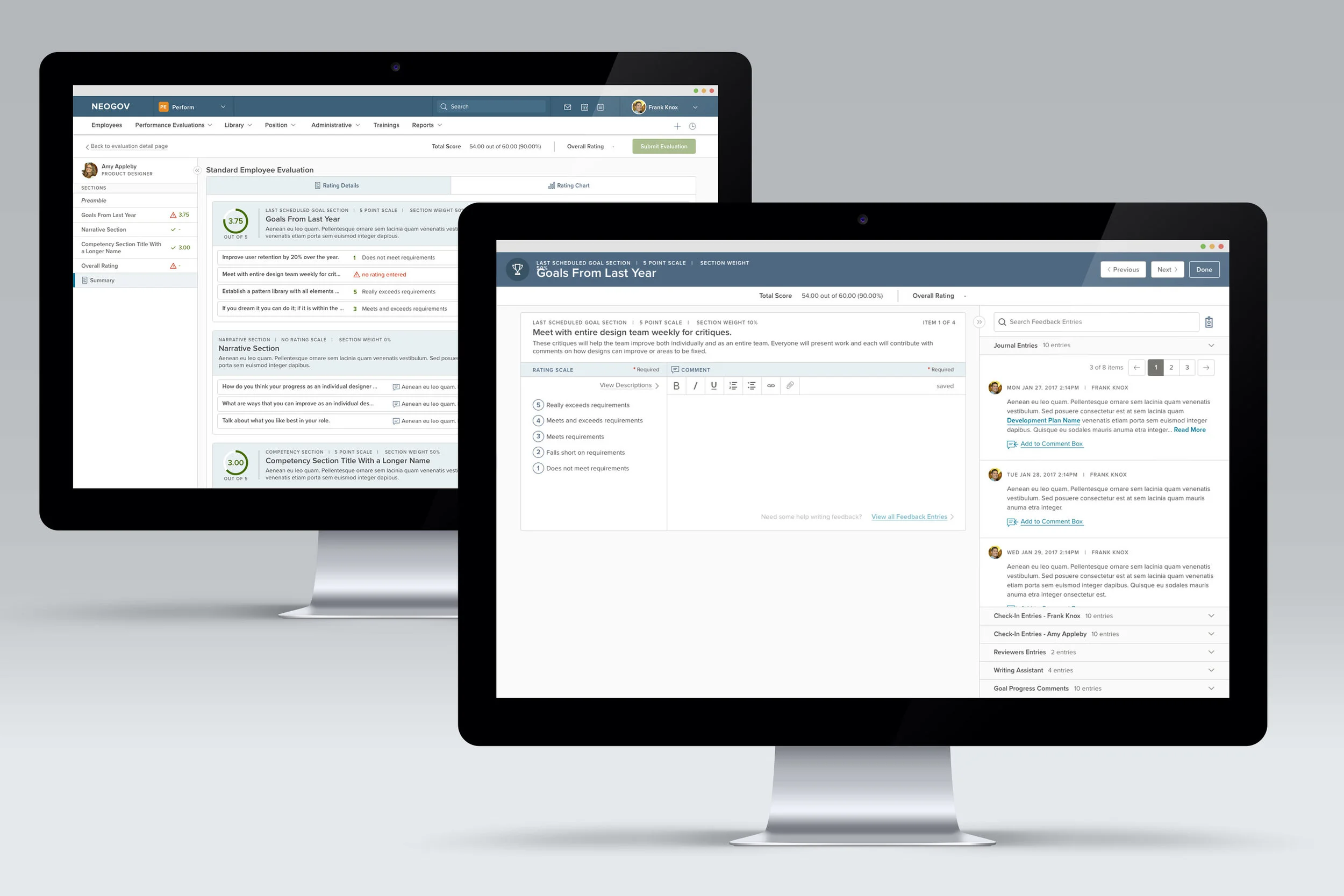
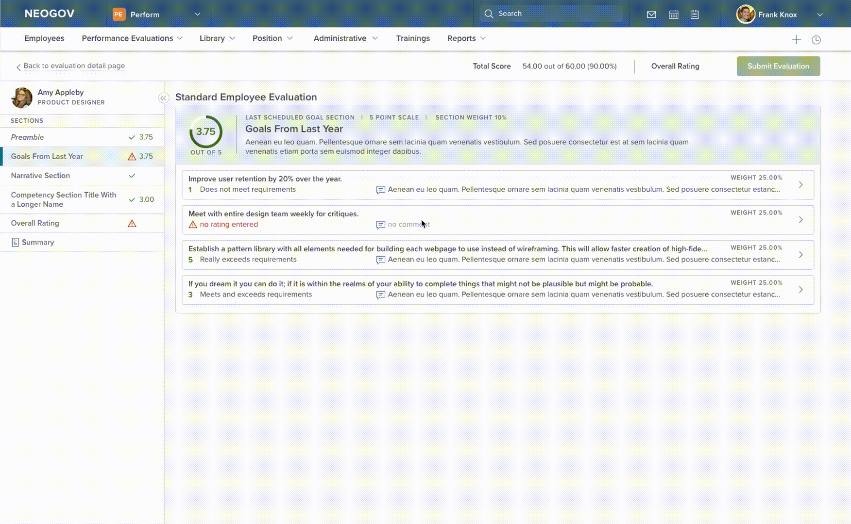
The final designs are a major improvement to the former. Customers have rejoiced in the fixed phantom scrolling and the improved layout. The users land in the first section to read the Preamble if the system administrator set it up for this evaluation. This page allows a disclaimer or other legal information to be placed at the beginning of the process before the rating takes place. Raters will open each item within the sections in a flyout. The flyout houses the information about each section, the name of the rating item, and the zone to select a numeric score as well as leave a comment.
Descriptions are show for the rating item as well as for each level of a rating scale. Raters are able to see, if given the permission, other raters results on this evaluation. Raters also have the ability to input comments from a bank of journal notes kept by the user conducting the rating. Collapsing the flyout will reveal the overall page behind which hilights required items which have not been filled in. Users can also view a chart of their ratings for a visual representation of the items rated. Once all required items have been rated, then the user can submit the evaluation to allow the process to continue.